Wednesday, 24 February 2010

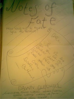
Possible poster ideas for ''Notes of Fate'' drafts

For this poster idea, I am thinking about making the colour scene dark i.e. black and white, with hints of orange and brown.

I want the text to be quite curly, old fashioned and loopy to give the effect of it being hand-written, like the notes that are involved within the film.

I imagine it also to have a dark background, probably black, with white contrasting text with a hint of the orange or brown.
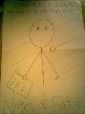

For this poster idea, I would like a similar colour theme, but instead of the orange/brown I want to use a dark blue colour which I feel could be done to draw certain aspects of some pictures to the viewer of the poster.

Again, with this poster, I would like the text to be fairly curly and fancy, to give the same effect as before. Although I want this, I would rather this text was more bold than that of the last idea's text as there is more going on in this poster idea, so a bolder and more out-standing text would be needed.

For this poster I want it to have a black background with white contrasting text for it to stand out well, but again, with a tint of the colour that is included within the colour scheme.
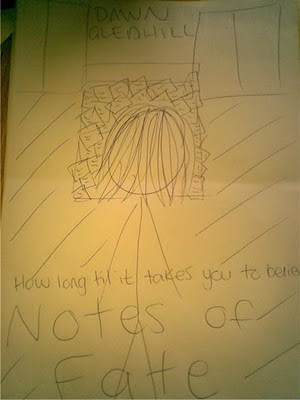

With this idea, I pretty much want the same colour scheme as the last idea; black, white and a dark blue theme.

The font on this picture, I want to be completely different to the ideas I have had for the last ones. This is because I want this one to have very bold capitalized text that stand out straight away.

The effect I want this one to have is that of a border. So that there is black around the whole of the picture, with the main focus being on the person, in the middle, and the text. This would also allow the text to be more noticeable as well.

Sunday, 21 February 2010

Conventions of Horror/Thriller film posters

Firstly, one thing that is usually present on the majority of any film poster is the names of the actors that are in the film. This is usually done by putting the main actors names in a slightly bigger text to what the other actors names in the film would be. By doing this, it shows the people viewing the poster who the main parts in the film are played by, to which they may be more interested in.

As well as this, another main feature which is included on the majority of all film trailers is that of a title. This would usually be the main focus of the film, in addition to a picture which has been shown to represent part of the film. The text of the title would be the largest piece of text on the poster to make it memorable to the viewer of the poster.

The title of most thriller or horrors would also be in a contrasted colour to the dark tonal colours of the background of the poster. This is to make it stand out from the rest of the poster and make it clearly visible. By doing this it makes it easier for the viewer to see it and makes it easier for them to be able to remember the name of the film.

I have noticed, that in the textual analysis's I did, the overall colouring and tone of the poster seems to be quite dark. This is because dark colours have more connotations to having a dark and scary atmosphere. I would class this as a convention of a thriller or horror film poster because it has being presented on all three of my analysis's.

As well as this, another feature that can be seen on all three of the posters I have analysed is that the main character or characters of the film are featured on the poster. This is accompany their name on the poster and make even more easily understandable to the viewer of the poster who the main part of the film is played by, and what the main character of the film looks like.

As well as the character being placed on the poster, in all three of the posters I analysed, the character all had worried, scared or emotionless faces. This is to set the mood of the film through a still image. The fact that they look worried and scared shows the type of events that may be happening throughout the films, and makes it easier for the viewer to understand the genre in which the poster is advertising.

In addition to all the other text on the poster, there is also a tag line to the film, or a short sentence to give an idea of the purpose and context of the film. For example, on the 'Flight Plan' Poster this 'tag line' is just above the title of the film, and it says "If Someone Took Everything You Live For... How Far Would You Go To Get It Back?" By giving this line on above the title where it can be clearly noticed, it allows the viewer to recognise that the film is about losing someone and fighting to get them back, but doesn't go into detail. This would make the viewer develop more of an interest to find out what happens, but also gives them an insight to the film so that they already have an idea of what may happen.

Poster Analysis - Sorority Row


This poster is from a film called Sorority Row. It is a thriller/horror which is about a group of American girl's who are part of a clique. One of the girls wants to get revenge on a boy, so the group of them arrange her fake death, but it ends up going too far. The boy they are seeking revenge on takes it too seriously and kills her for real.

From this poster we can clearly see the dark tone of colours, which is conventional of thriller posters, as dark colours have connotations with a dark and spooky atmosphere. The use of the black colouring on the poster contrasted with the bright orange of the fire makes the rest of the poster stand out, such as the characters of the film in the middle.

The fact that all the girls are intertwined on the front of this poster connotes that they were close in relationships, meaning they were close friends. But what this also does, is show their limp bodies hanging over one another, giving the impression they are dead, which could also be seen from the complexion of their skin; with it being pale and motionless. By doing this, it gives the viewer an insight in to the sort of events which may take place within the film, such as death, making it an obvious thriller/horror.

The title of the film is done in white, and I feel this helps the consistency of the poster, as the white pale skin of the characters is brought through into the text of the film. In addition to this, the red line underneath the white text also borders the full poster, as within the middle it is almost just black and white colouring, where as the top is bright orange, so the fact the red is at the bottom helps surround the duller tones. The fact this is line is red also gives connotations with their being danger and bloody events happening, as red is iconic of this sort of thing.

Included on this poster is the names of actors playing roles in this film, and also the date in which the film comes out. These two things are iconic of film posters, as it raises viewer's awareness of the film, which may increase their desire to view it.

Thursday, 18 February 2010

Poster Analysis - The Others


This is a poster advertising a film called the others. This is a thriller/horror about a family who are experiencing paranormal activity within their household. But a twist to the story reveals that they are the ones haunting the house and their ghosts are alive still.

The use of the dark colouring makes it obvious it's a thrilling and scary film due to the connotations that dark colours have with a scary atmosphere. The use of the black makes it seem as though it's dark, which is one of the most common fears, which in effect would straight away trigger the knowledge that it is a thriller film.

The contrast between the black background and the orange light works well to highlight the main character of the film but also to make part of the poster stand out and catch the viewer's attentions.

The title of the film is done in all capital letters which gives the effect of it being important, making the viewer think it's a good film. It is also done in white and faded orange, which is consisting with the colour of the main focus of the poster. This makes it easier for it to be noticed and makes it stand out from the rest of the poster.

The fact that the character on the poster is holding an old fashioned oil lamp makes it apparent that this film is set in the past; giving some extra insight into the film for the viewer, which may result in them having more interest in the film, or finding it a more interesting.

The actors name is placed on the poster, and this is the only name that is placed on this poster. Usually you would see the names of most other actors in the film on the poster. This may have being done as the main actor; 'Nicole Kidman' is a fairly famous actress, which would attract the viewer's attention without the help of anyone else's presentation within the film.

Tuesday, 9 February 2010

Poster Analysis - Flight Plan


This poster was put out to advertise the film 'Flight Plan', which is a thriller about a woman who is portrayed as being 'crazy' after her daughter goes missing on an aeroplane. The main actor in this film is Jodie Foster.

The use of the dark colours makes it come across as a thriller and dark tonal colours are related to dark atmospheres, which would be present in this film. The choice of colour has also being cleverly chosen as the light blue matches the characters eye colour perfectly, and the dark navy and black colours match her costume.

The way the name of the film is written coincides with the storyline of the film. As you go to the right of the text, it almost takes on the characteristics of a plane that is travelling at fast speeds. It could also be recognised as a plane that is becoming out of control and heading for danger, which is what the film is about.

The fact the text is white directly contrasts to the black and blue colours that are used for the background of the poster, making it obviously visible to the viewer of the poster. The white also matches with the colour of the text used to show who the main character of the film is. This is done to keep consistency within the poster so it's more appealing to the viewer's eye.

This poster, as well as most others, has the names of the actors included in the film. This is to show the viewers of the poster to recognise some of the actors and maybe develop more interest in the film.

Poster Research

For this part of my coursework I am creating a poster which will accompany the release of the film. I would most like my poster to be put out either on to a bus stop board, or within the magazine, as a double page spread pull-out in the middle, which I will be creating folling this section.

I have researched the dimensions of the posters I wish to develop.

The bus stop poster's dimensions will be as follow:


This means that while doing my editing on the photos to get them to a poster presentation standard, I will also have to arrange to do the poster within these dimensions so that will realistically be able to be put out as a method of advertising the film.


My other idea, of doing a poster which would be included in the magazine, which I have to do a front cover for, would just be two A4 sizes, as a magazine is typically an A4 size, and since it's going to be a double page spread, it's going to be two of these.

These dimensions would be: 460 x 300 mm (Width x Length).

After thinking about which option would be best to produce, I have decided that doing the poster which is included within the magazine is best, as I believe it would help the two products intertwine and be cleverly related.

Finished video