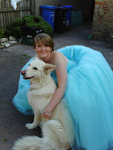
As this is the picture I am using first, as a plan for my poster, I had decided I wanted it to be quite dark to go with the conventions of Thriller/Horror film posters. So, to do this I used Microsoft Office Picture Manager, and just played around with the levels of colour balance, brightness and contrast, till I felt it was close to what I needed it to be.

 The reason I wanted this picture to be so dark, is because I previously copied the picture, and I am going to use Adobe Photoshop to merge them together (the light and dark version) to give the effect of it being dark and spooky, but still being able to see the actual person in the picture.

No comments:
Post a Comment